0
그림처럼 (예 : 전체 화면에서 코드 실행) 예를 만들었지 만, 이렇게하는 것이 더 좋은지 묻습니다. 내가 웹 페이지를 확대하면 모양의 경계선이 보입니다. 그래서 한 객체에 육각형을 만들고 배경에 직사각형을 추가 할 수 있습니다.백그라운드에서 사각형이있는 육각형 모양을 어떻게 만들 수 있습니까?
조언 해 주셔서 감사합니다. 예 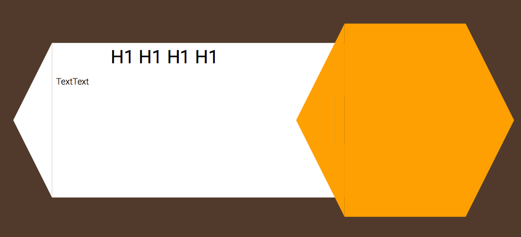
.arrow-left {

    margin-top: 40px;

    width: 0;

    height: 0;

    border-top: 160px solid transparent;

    border-bottom: 160px solid transparent;

    border-right:80px solid white;

    vertical-align: top;

}


.backwhite{

    margin-top: 40px;

    width: 50%;

    height:320px;

    background-color: #FFFFFF;

    color:#000000;

    vertical-align: top;


}


.arrow-left_yellow {


    width: 0;

    height: 0;

    border-top: 160px solid transparent;

    border-bottom: 160px solid transparent;

    border-right:80px solid #FFAA00;

    float:right;


}

.arrow-right_yellow {

    width: 0;

    height: 0;

    border-top: 200px solid transparent;

    border-bottom: 200px solid transparent;

    border-left: 100px solid #FFAA00;


}

.cube {

    width: 250px;

    height: 400px;

    background-color: #FFAA00;

}


.backwhite, .arrow-left,.arrow-left_yellow ,.arrow-right_yellow,.cube{

    display: inline-block;

}


.backwhite-text{

    float:left;

    width: 80%;

}


.backwhite-text >h1{

    color:#000000;

    text-align: center;

}

.backwhite-text>p{

    color:#000000;

}


.trapezoid {

    vertical-align: top;

    margin: 40px 0px;

    position: relative;

    display: inline-block;

    width: 20px;

    height: 320px;

    background-color: #FFAA00;

    color: white;

    font-size: 2rem;

}

.trapezoid::before {

    content: "";

    position: absolute;

    top: -40px;

    border-top: 40px solid transparent;

    border-left: 0 px solid transparent;

    border-right: 20px solid #FFAA00;

    border-bottom: 111px solid #FFAA00;

}

.trapezoid::after {

    content: "";

    position: absolute;

    bottom: -40px;

    border-bottom: 40px solid transparent;

    border-left: 0px solid transparent;

    border-right: 20px solid #FFAA00;

    border-top: 111px solid #FFAA00;

}


#single-project{

    padding-top: 310px;

}
<div id="single-project">
<div class="arrow-left"></div><div class="backwhite"> <div class="backwhite-text"><h1>H1 H1 H1 H1</h1><p>TextText</p></div><div class="arrow-left_yellow"></div></div><div class="trapezoid"></div><div class="cube"></div><div class="arrow-right_yellow"></div>
</div>
여기 CSS로 모양을 만드는 방법에 대한 안내입니다 : https://css-tricks.com/examples/ShapesOfCSS/ – Andrew
감사합니다,하지만 육각형의 배경에 흰색 사각형이 필요합니다. Z- 색인. 아래 답변. :) – GrofMonteCristo