6
저는 브라우저 크기 조정에 반응 할 수 있고 진행 상황을 쉽게 변경할 수있는 온도계와 같은 진행률계를 작성해야하는 iPhone 및 Android 브라우저 용 프로젝트를 진행하고 있습니다. 가능한 한 디자인과 같아야합니다. 즉, 멋진 그라디언트, 강조 표시 삽입, 테두리가 필요합니다.복잡한 모양을 CSS로 작성하기
미터 :
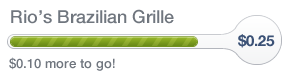
공지 사항 흰색 삽입 그림자 및 테두리
진행뿐만 아니라 원형 부분으로 확장하고 화려한 효과를 계속해야한다.
내가 나서서 (크롬에서 테스트) 작업을 거친 프로토 타입 http://jsfiddle.net/xduQ9/3/
html,

body {

    padding: 25px;

}


.circle {

    margin-left: -6px;

    width: 48px;

    height: 48px;

    border-radius: 25px 25px 25px 24px;

    border: solid rgba(178, 181, 188, 0.8) 1px;

    box-shadow: inset 1px 2px 0 #fff, inset 1px -2px 0 #fff, inset -2px 0 0 #fff, inset -2px -2px 0 #fff, inset 0 3px 0 rgba(255, 255, 255, 0.35), -20px -20px 0 #fff, 20px -20px 0 #fff, 20px 20px 0 #fff, -20px 20px 0 #fff;

}


.circle-wrap {

    overflow: hidden;

    width: 48px;

    height: 51px;

    position: absolute;

    right: 0;

}


.wrap {

    display: -webkit-box;

    width: 100%;

    position: relative;

    height: 51px;

    overflow: hidden;

}


.progress {

    position: absolute;

    z-index: 0;

    height: 100%;

    width: 70%;

    background: url("http://dl.dropbox.com/u/905197/white-stripe-diagonal.png"), -webkit-linear-gradient(top, rgba(183, 237, 21, 1) 0%, rgba(140, 186, 24, 1) 28%, rgba(78, 126, 11, 1) 65%, rgba(59, 86, 0, 1) 99%);

}


.meter.complete .progress {

    width: 100%;

    -webkit-animation: progress-slide 0.6s linear infinite;

}


@-webkit-keyframes progress-slide {

    0% {

    background-position: 0 0;

    }

    100% {

    background-position: 25px 25px;

    }

}


.progress-cover {

    position: absolute;

    top: 19px;

    width: 70%;

    height: 12px;

    border-radius: 9px 0 0 9px;

    border: solid #70901b 1px;

    border-right: 0;

    z-index: 2;

}


.top-mask {

    position: absolute;

    box-sizing: border-box;

    width: 100%;

    height: 18px;

    padding-left: 45px;

    margin-left: -45px;

    background: white;

    border-bottom: solid #b2b5bc 1px;

    border-radius: 0 0 33px 0;

    box-shadow: 1px 2px 0 #fff, 0 3px 0 rgba(255, 255, 255, 0.35);

}


.bottom-mask {

    position: absolute;

    bottom: 0;

    box-sizing: border-box;

    width: 100%;

    height: 17px;

    padding-left: 45px;

    margin-left: -45px;

    background: white;

    border-top: solid #b2b5bc 1px;

    border-radius: 0 19px 0 0;

    box-shadow: 1px -2px 0 #fff;

}


.inner {

    position: absolute;

    top: 0;

    left: 2px;

    width: 3px;

    height: 12px;

    border: solid 3px #fff;

    border-right: none;

    border-radius: 5px 0 0 5px;

}


.meter {

    position: relative;

}


.left-border {

    position: absolute;

    top: 17px;

    left: -4px;

    width: 10px;

    height: 16px;

    border-radius: 12px 0 0 12px;

    border: solid 1px #b2b5bc;

    border-right: none;

    z-index: 3;

}
<div class="meter complete">
<!-- Remove .complete to stop animation -->
<div class="left-border">
<div class="inner"></div>
</div>
<div class="wrap">
<div class="progress"></div>
<div class="top-mask"></div>
<div class="bottom-mask"></div>
<div class="circle-wrap">
<div class="circle"></div>
</div>
</div>
</div>기술은 기본적으로 클립 모서리가 둥근 몇 div의와 줄무늬 녹색 배경으로 사각형을 얻었다 원하는 모양이 나올 때까지 그런 다음 나는 그림자를 사용하여 패딩과 미터 주위의 삽입을 추가합니다.
내 질문 : 당신은 무엇을 할 생각입니까? 내 말은, 나는이 솔루션을 약간 최적화 할 수있다. 디자인을 올바르게하기 위해 마크 업을 추가 할 수는 있지만 너무 더러워 보입니다. 브라우저 간 테스트에는 쉽지 않을 것 같은 느낌이 들었습니다. 나는 캔버스를 사용하는 것에 대해 생각했다. 그러나 브라우저가 크기를 재조정하면 모양을 다시 그리는 데는 짜증이 난다.
이미지를 가능한 한 많이 사용하지 않는 것이 좋습니다. 그렇다면 세련된 솔루션을 사용할 수 있다면 확실히 사용하겠습니다.
진행률 표시 줄의 색상을 변경할 수있는 기능은 구현 요구 사항이 아니지만 그 기능을 갖춘 솔루션을 원합니다.

업데이트 바이올린입니다. 크롬처럼 보이지 않습니다. http://jsfiddle.net/xduQ9/8/ –