1
컨텍스트 : 컨테이너에 display: flex을 사용하고 페이지의 중앙에 수직으로 한 개의 svg 요소를 중심으로 정렬합니다. 페이지의 유일한 다른 점은 A) 문서 흐름에서 벗어나 공간을 차지하지 않는 고정 헤더와 B) 공간을 차지하지 않아야하는 position: absolute의 바닥 글입니다. 센터링은 모바일 크롬/모바일이 아닌 모든 브라우저에서 올바르게 작동합니다. 파이어 폭스 모바일에 올바르게 수직 센터링이 나타납니다.Flexbox 수직 센터링/모바일 브라우저 문제
문제 : flex 컨테이너의 하위 요소가 IOS Safari 및 Chrome Mobile에서 중앙에 배치되지 않습니다. 어떤 이유로 주소 표시 줄이 정렬을 벗어나는 것처럼 보입니다. 누구든지 어떤 통찰력을 제공하거나 문제를 디버깅하는 방법을 도와 줄 수 있습니까? chrome dev 도구에서 문제를 재현 할 수 없습니다.
도움을 주시면 감사하겠습니다. 커뮤니티에 감사드립니다. project link 안드로이드 또는 아이폰 장치에 문제를 복제 할 수 있는지 확인 :
.logo-flexcontainer {

    align-items: center;

    display: flex;

    height: 100vh;

    margin: 0 auto;

    width: 90%;

    @media (min-width: 1024px) {

    width: 50%;

    }

}


.logo-flexcontainer > div {

    flex: 1 0 auto;

}


#mobile-navbar {

    display: flex;

    align-items: center;

    position: fixed; /* Set the navbar to fixed position */

    width: 100%; /* Full width */

    height: 50px;

    top: 0; /* Position the navbar at the top of the page */

    transition: transform .1s ease, background-color .5s ease;

    &.hidden {

    transform: translate3d(0,-100%,0);

    }

    &.scroll-background {

    background-color: rgba(0, 0, 0, 0.8)

    }

    @media (min-width: 1024px) {

    display: none;

    }

    #page-title {

    margin: 5px 0 0 5%;

    h3 {

     font-size: 6vw;

     text-shadow: 1px 1px #000;

     @media (min-width: 600px) {

     font-size: 2rem;

     }

     a {

     text-decoration: none;

     }

    }

    }

    #hamburger {

    position: absolute;

    width: 50px;

    height: 50px;

    top: 5px;

    right: 10px;

    cursor: pointer;

    span {

     display: block;

     position: absolute;

     height: 6px;

     width: 100%;

     background: #FFFFFF;

     box-shadow: 1px 1px #000;

     &:nth-child(1) {

     top: 6px;

     }

     &:nth-child(2) {

     top: 18px;

     }

     &:nth-child(3) {

     top: 30px;

     }

    }

    }

}


footer {

    position: absolute;

    text-align: center;

    left: 0;

    bottom: 0;

    height: 100px;

    width: 100%;

    svg {

    \t height: 90%;

    @media (max-width: 550px) {

    \t \t height: 80%;

    }

    }

}
<div class="logo-flexcontainer">
<div>
<svg id="logo" xmlns="http://www.w3.org/2000/svg" viewBox="0 0 598.6 323.5">
<g>svg code goes here...</g>
</svg>
</div>
</div>
<footer>
social icons here, code not important
</footer>크롬 모바일 및 파이어 폭스 모바일 홈페이지의 두 장의 사진입니다. 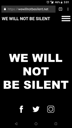
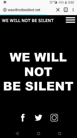
왼쪽은 잘못된 방향이고, 오른쪽은 예상 된 결과입니다.
고정 된 헤더가 모바일 웹킷 브라우저의 문서 플로우에서 제거되지 않는 것처럼 보입니다. –
'height : 100vh'에서 percent,'height : 100 %'로 변경 한 다음'height : 100 %'를 모든 부모에게 추가하면 어떨까요? 'html, body {height : 100 %; }' – LGSon
@Michael_B : 당신은 올바른 방향으로 생각하고있을 것입니다. 내 첫 번째 본능은 주소 표시 줄이 문서 흐름에 추가된다는 것입니다. LGSon이 제안한 솔루션을 사용해 보겠습니다. –